AutoGraf Insights

Finishing Times

A simple pie chart that works on an average time the last job of the day was signed off. Calculated for the period of a calendar month. It's designed to indicate who goes home early.

 
Finishing Times

Feature Summary

  • Finishing Times - Average Last Job Sign-Off
  • Easy to visualise Pie-Chart
  • Highlight Engineer Last Job Sign-off
  • Shows and Average based on a Calendar Month
  • View any Historical Data for Analysis
  • Print, Share and Discuss with Colleagues
AutoGraf Insights*

Job Completion

Polling the system every 30 seconds for updates. This tool updates on job completion by your Field Service team. The metric across the bottom of the chart shows the number of allocated jobs for the day.

 
Job Completion

Feature Summary

  • Job Completion by Customer Signature
  • Real-time Update. System polls every 30 seconds
  • Works well with Large Format Displays
  • Custom Filters for Date Ranges
  • Show Historical Data for Analysis Comparison
  • Instant Job Count and Completion Times
AutoGraf Insights*

Visual Data Dashboards


How Does it Work?

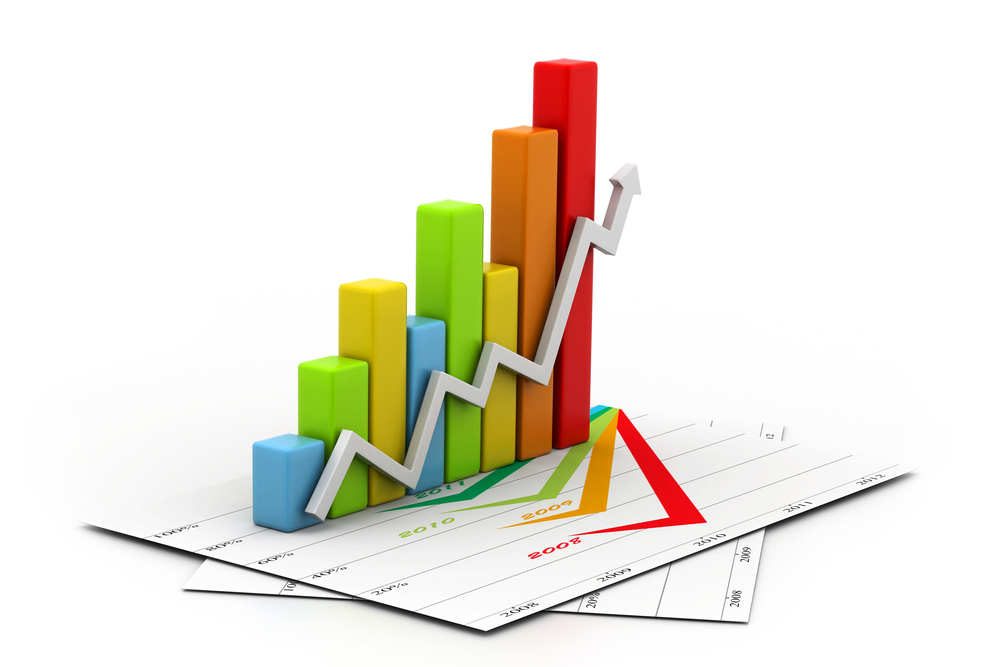
The data that you input throughout AutoVu is used to drive our charts and graphical dashboards. Utilising powerful algorithms, we can represent your data in a way that really brings the information forward, visually and with impact.

There are a number of pre-defined charts and graphical dashboards already defined, we are constantly adding to the list on a regular basis! Many of the dashboards in use on AutoVu are through direct response to our customers requirements. So if you think there may be a need for a new dashboard, go ahead and tell us. If it's possible, we often have these up and running within a few days.

How's that for good service!


What Makes a good Dashboard?

Practically any data can be turned in to a great looking chart or graphic, some graphics are easily produced whereas others may take us a little time working out the metrics needed, and what it is that makes the graphic useful.

We have included a few examples below that revolve around the Field Service Management module.

For the most part, we really do rely on our customers to define what they need from a dashboard and respond accordingly. You can of course customise these with filters and date ranges etc. You can share with colleagues or simply print them out.

One thing is for certain, AutoGraf will certainly highlight a few points that maybe worth looking at.

Working Day

Ever wondered who puts all the hours in? well this handy chart tells you in an instant just that! It works by taking the start time of the first job of the day, and the customer sign-off time for the last job completed.

 
Working Day

Feature Summary

  • Working Day - Who puts in the Hours?
  • Real-time Live Data Feed
  • Colour Coded for Easy Identification
  • Show Historical Data for Quick Analysis
  • Share, Print or Email
  • Instantly see who Puts in the Hours
AutoGraf Insights*