It's a difficult one to monitor effectively, even with some of the best tools available. One could even go as far and say 'it's simply spyware', however, the bottom line is you send your employees home in good faith that the work you are paying for actually gets done.
For some companies, this has been in force for some time, further, there have been many discussions over the boardroom table whether to take the plunge and further increase the number of home workers. There are clearly pro's and con's to this.
The Pro's
Working from home has the clear advantage of allowing an element of 'Flexitime' for the employee. This is a big plus point for those with younger families having to juggle time between family life and work. It even allows some level of productivity during periods where the office is actually closed.
From the employer perspective, this could even lead to reducing office space which ultimately reduces costs when considering smaller premises / rent.
The Con's
Clearly, the impact on a person's well being can be considered. For some, getting out of the house, going to work and meeting other members of the team is their only social life. Taking this away can have a serious impact on a person's mental health.
On the flip side of this, are your staff actually doing any work or are they simply watching the TV or doing house work?
How can we monitor this?
There are a number of tools you can use, but from a Workforce Manager perspective, we have been asked by a number of our customers the very same question. In response we have introduced a small module that allows you to monitor system activity on a simple activity monitor and bar graph.
Who is Online ?
|

|
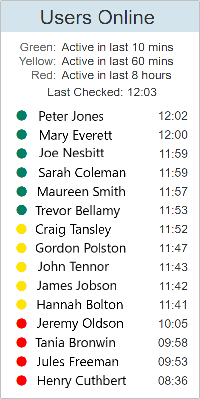
The panel indicates all users that have been online / active over the course of 3 days. The colour coding highlights what time within the current day that the user last made an update. A simple traffic light system has been utilised to highlight who is currently active and how long ago the last update was made.
Green: Users shown highlighted with a green indicator have been online and have made an update within the last ten minutes.
Yellow: This indicates that the user has been online in the last hour, but has not made an update over the course of the last ten minutes.
Red: These users have been online and made an update, but not in the last hour.
Grey: Users with a grey indicator have not been online or made an update for over 8 hours.
|
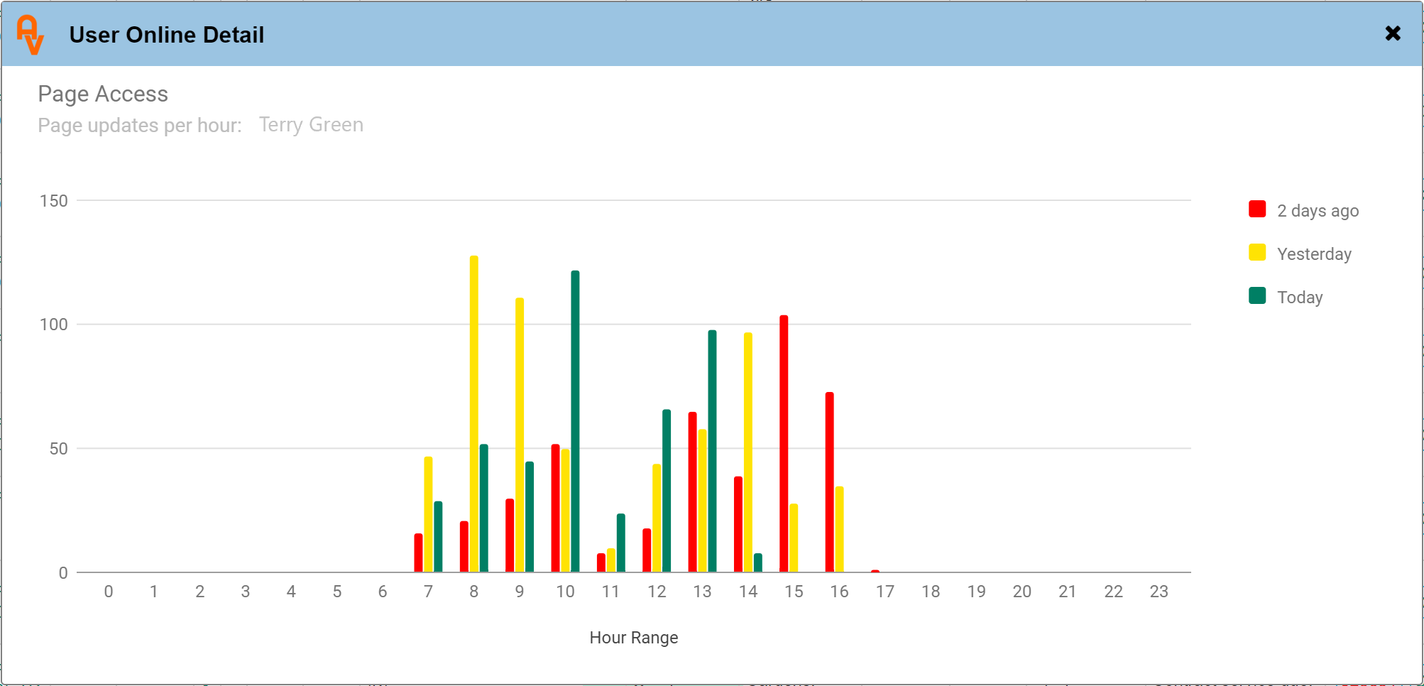
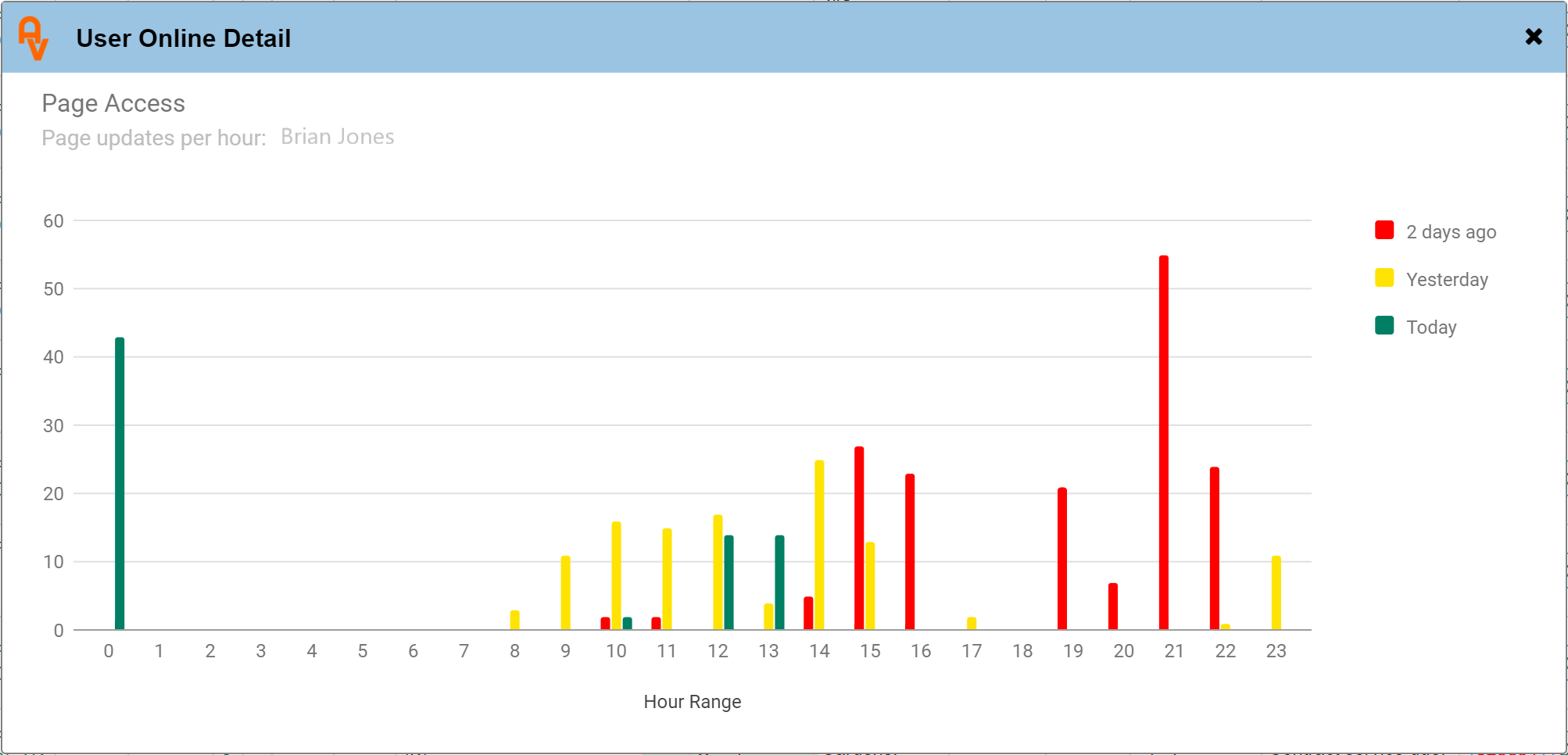
Clicking on any of the names opens up the detailed activity panel showing up to 3 days of access. Below are a couple of examples showing detailed activity over the course of 3 days;


The two graphs show differing times of access. The first graph indicates that over the course of 3 days, all work was done within normal working hours. The second graph on the other hand shows that some work was completed well outside of normal office hours. Overall, the same amount of work was done but at times to suit the user.
Is it useful?
Only time will tell, we will certainly monitor the usefulness of this module and tweak where required. In the meantime it is available now for all of our users. As always, it's permission based so easily switched on / off per user where required.
Please contact us if you have any questions about this or perhaps further enhancements? One thing is for sure, home working is here to stay !
If you would like to know more about AutoVu and what we can do to help your business, why not check out our Frequently Asked Questions page, or Contact Us any time to discuss your specific requirements.