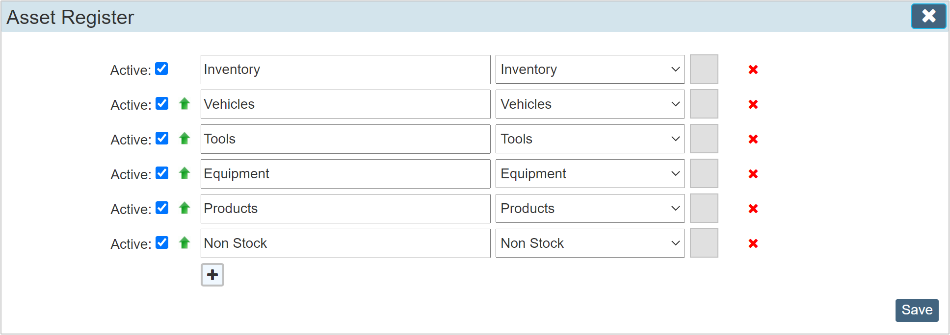
The sections within the settings section primarily adhere to a similar theme. Below we detail how the general layout of any particular section works detailing the basic conventions used throughout. Variations to this will be detailed separately within its corresponding Guide.
For this example, we will use the 'Asset Register' as it uses a number of fields. Some lists do not utilise all of these.

Active
Simply means that detail line will be available for selection within the area used. If the checkbox is cleared, the item will remain in force throughout your system, but will no longer be available for selection.
Green Up Arrow
This allows you to order the details into groups. Click the up arrow on a given line and it will move up the list swapping places with the one above. When viewed within a drop down list containing this information, the details will be ordered as you have them here.
Description
The description field allows you to indicate the value or detail of this line item.
Drop Down List
Some detail lines allow you to select a particular value from a drop down list.
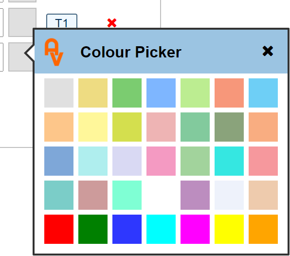
Colour Picker Box
The colour picker box is a standard item in all custom values sections. Its use within the system is varied. I.E. some items show the colour selected within the page you are working on.

Red Delete X
The cross at the end allows you to delete a line completely. Unless you are just setting things up and have entered a few lines of detail in experimentation, we would advise not deleting. Instead of deleting a detail line you may no longer use, consider just making it 'Inactive' by clearing the corresponding checkbox in the 'Active' column.